

The Process Behind Designing a Sportswear Brand
Each week, I save many design briefs from a variety of Instagram accounts & narrow down what I want to work on.
Brief challenges are fake brands with guidelines helping you create brands for fun!
They’re a great way to build up your portfolio & confidence in designing.
Some fun accounts with weekly briefs to check out:
Here’s what I chose for that week.
The Brief
VIDA is a sportswear & outerwear company that was started by a group of young minds who sells their brand to the younger generation. The aim is to motivate people to push their limits & stay fit. The collection is a combination of style & substance. They offer sportswear for all men & women & customize their clothing & accessories based on their liking. VIDA is looking for a brand identity as versatile & dynamic as their brand.
This brief was from another favorite account The Brief Tribe.
Mood Board
After I narrow down the brief, I find inspiration on Pinterest.
I narrow down that inspiration even more in Illustrator, you can see my quick mood board below.
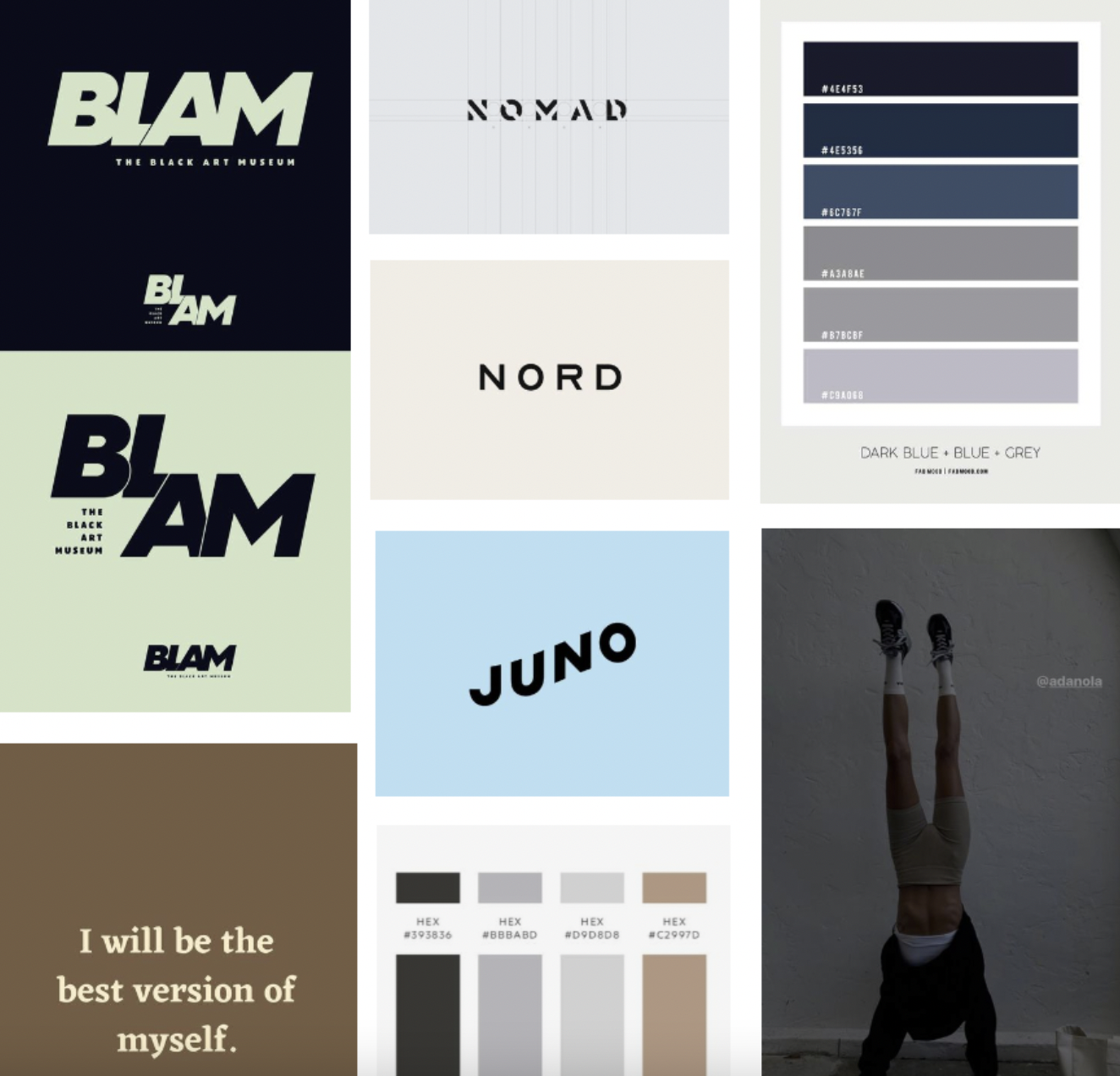
I liked the strength of the blue/grey palette, but that striking green stood out to me.
The mood board also helped me figure out the font direction.
Sketches
I quickly sketched out a few formats & ideas before jumping into fonts.
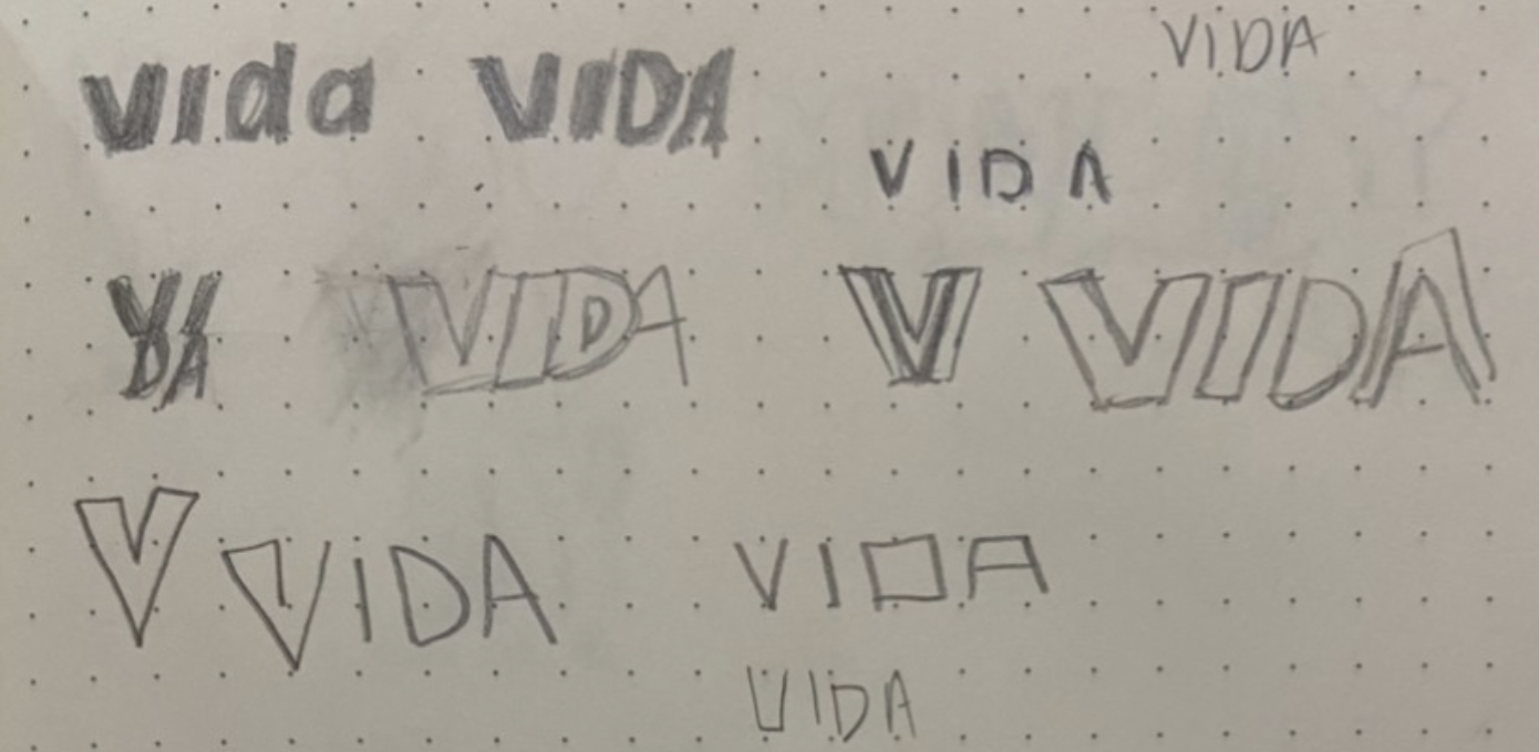
Since I wasn’t including an icon or illustration, there weren’t too many sketches.
Either way, it’s always helpful to get some ideas out & it’s fun to look back & see how those ideas formed.
Fonts
I knew I wanted something in all caps & italics. The font itself didn’t matter too much, I was going to customize it, I just needed a good base.
You can see me considering different font options & even font pairings in the right column.

I expand a couple of fonts & customize them to see which best fits my vision.
I really like softening the harsh edges & repeating elements, which you can see done with the V.
Logo Variations
Once I found a wordmark I was happy with, I played around with the different variations.


The submark is a simple combination of letters & the off-center words make for a more dynamic primary logo.
I also thought I could create more versatility throughout the brand system by using the outlined stokes as a design element.
Once I have the variations down, I’ll create a couple of brand patterns in different colorways before moving to the next stage of the process.
Photography & Mockups
After I celebrate finishing the logos, I get started on finding photography that fits the vibe.
I also start looking for mockups to really bring the brand to life.
Once I find a few free mockups, I get the dimensions & start designing the other touchpoints for the brand.
This can be anything from social media posts, business card designs, menu designs, packaging designs, or a little bit of everything.
Which leads us to the brand board!
Brand Board
Having a brand board is simply a way to showcase all the elements together.
We can see the color palette, logo variations, brand patterns, brand photography & mockups, all in one place.

THANKS FOR READING!
I really love how VIDA turned out & I hope you do too! Let me know in the comments!
Click the image below to share directly to your Pinterest ↓
